Dashboards
Dashboards let you build custom monitoring screens from UNS data. Pick the topics you care about, choose a visualisation type, and arrange panels on a flexible grid — all in one place. Whether you need a high-level overview of an entire production line or a focused view of a single sensor, dashboards adapt to your use case.
Why Dashboards? Data Explorer shows one topic at a time. Dashboards let you combine multiple topics into a single screen so you can correlate signals, spot patterns, and share views with your team.
Dashboard List
When you open the Dashboards page you see all existing dashboards. You can switch between grid and list views, search by name or description, and filter by All, Starred, or Recent tabs.
- Folders — group related dashboards together on the left panel (e.g. one folder per production line or per team). Click New Folder to create one.
- Star — pin a dashboard to your quick-access list so it appears under the Starred tab.
- Recent — dashboards you opened recently are tracked automatically for quick access.
- Duplicate — use the context menu on a dashboard card to clone it as a starting point for a new one.
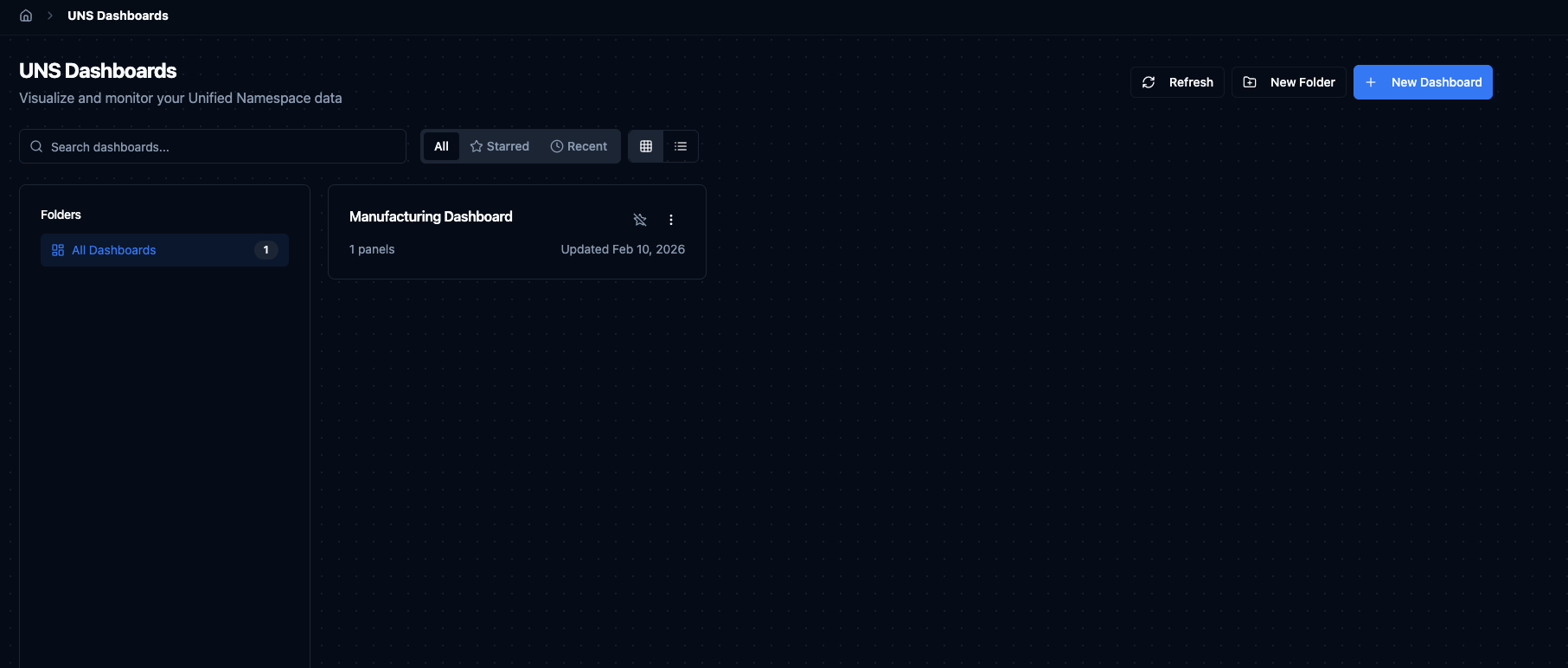
Dashboard list with folder navigation, search, and grid/list view toggle.
Creating a Dashboard
Click + New Dashboard to open the creation dialog. Enter a Name for the dashboard and an optional Description, then click Create. The dashboard opens in edit mode immediately, ready for you to add panels.
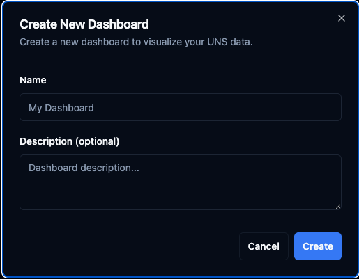
Create a new dashboard by providing a name and optional description.
Dashboard View
A dashboard displays all its panels side by side on a grid. The toolbar at the top gives you quick access to the time range selector, refresh button, auto-refresh interval, and actions like star, share, and full-screen mode. Click the three-dot menu to access Edit Dashboard, Add Panel, and Dashboard Settings.
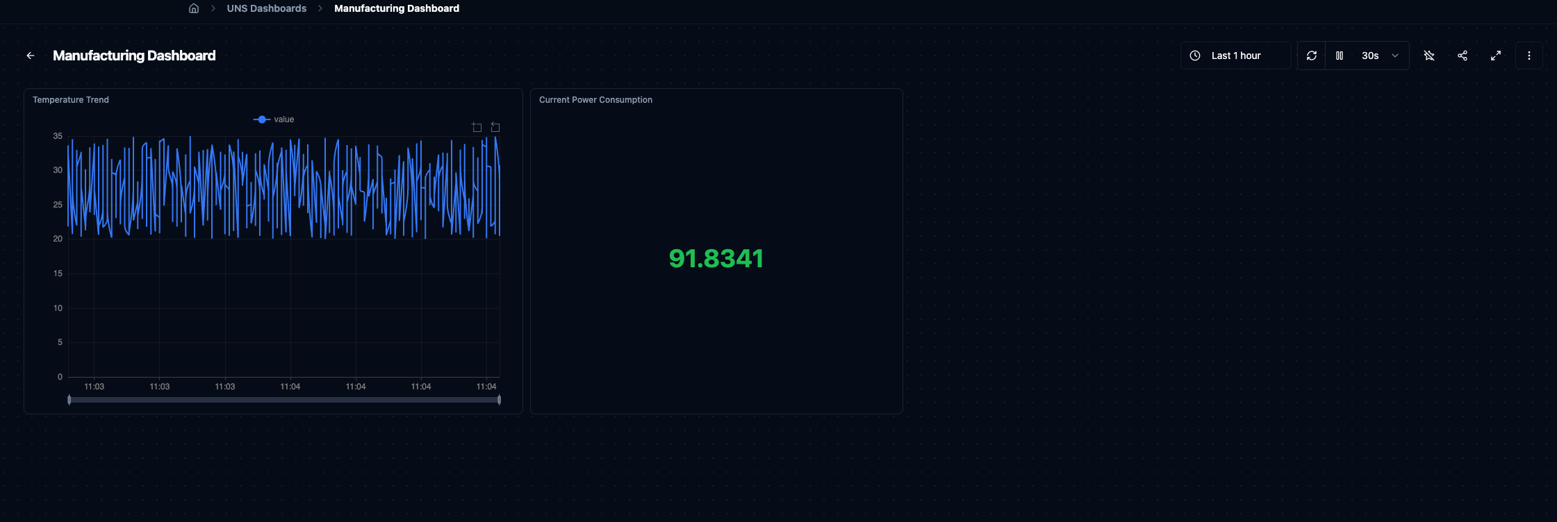
A dashboard with a Temperature Trend line chart and a Current Power Consumption stat panel.
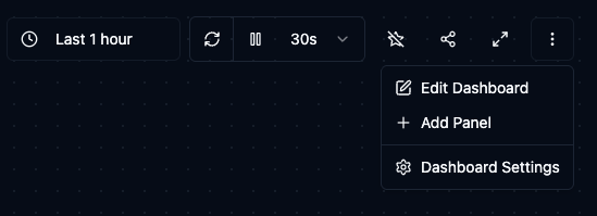
Use the toolbar menu to edit the dashboard, add panels, or open dashboard settings.
Panels
Panels are the building blocks of a dashboard. Each panel connects to one or more UNS topics and renders the data with a chosen visualisation.
Adding a Panel
Click Add Panel from the toolbar menu or from edit mode. The panel editor dialog has two sides:
Left — Select Topic & Fields: Browse the UNS topic tree to find the topic you want. When you select a topic, the system reads a sample of its data and lists the available fields with their types. Check the fields you want to visualise (e.g. value, temperature).
Right — Choose Visualization: The system suggests suitable panel types based on the selected fields — for example value Over Time (line chart), Current value (stat), value Gauge, or Data Table. A live Preview updates as you change your selections. Give the panel a Panel Name and optional Description, then click Add Panel.
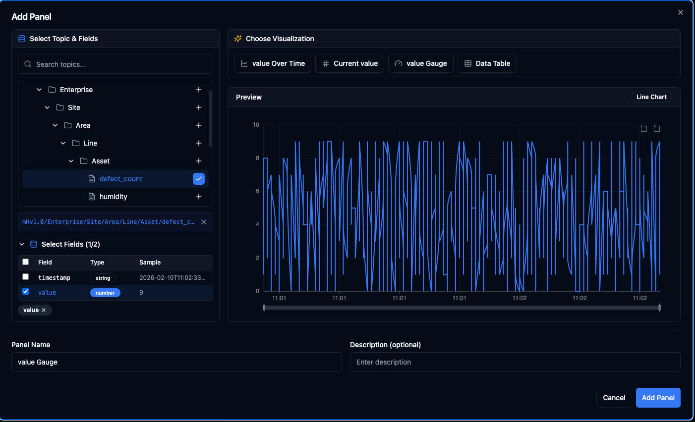
Select a topic and fields on the left, pick a suggested visualisation on the right, and preview the result before adding.
Panel Types
| Type | Best For | Notes |
|---|---|---|
| Line | Time-series trends | Configurable line width, fill opacity, point size, and staircase mode. |
| Stat | Single current value | Large number display with optional sparkline. Color modes: value, background, or none. |
| Gauge | Value within a range | Shows where the current value sits between a defined min and max. |
| Bar | Categorical comparison | Horizontal or vertical orientation with optional value labels. |
| Pie | Part-to-whole ratios | Donut mode available. Labels can be inside, outside, or hidden. |
| Heatmap | Density over time | Color scheme options (blues, greens, reds, viridis). Supports aggregation: avg, sum, count, max, min. |
| Candlestick | OHLC data | Map open, high, low, close fields and optionally display volume. |
| Sankey | Flow between stages | Define source, target, and value fields for flow visualisation. |
| Table | Raw tabular data | Column selection, sortable by any field. |
| State Timeline | State changes over time | Ideal for boolean or categorical values like machine on/off status. |
| Text | Static notes | Markdown content — useful for instructions, links, or annotations on the dashboard. |
| Topic Tree | UNS hierarchy view | Browse part of the topic tree inside the dashboard. Optionally show live values. |
| Alert Status | Alert summary | Filter by topic and group alerts by severity, topic, or ungrouped. |
Topic Limits per Panel
Most panel types support up to 10 topics. Single-value panels (Stat and Gauge) are limited to 1 topic since they display one number at a time.
Layout
Dashboards use a 24-column grid. Each panel occupies a position (x, y) and a size (width, height) measured in grid units.
- Drag a panel to reposition it on the grid.
- Resize a panel by pulling its edges.
- Minimum panel size is 2 x 2 grid units.
- Maximum width is 24 grid units (full row). Height is unlimited.
- Panels snap into place automatically with a 16 px margin between them.
Time Range
Every dashboard has a global time range that applies to all panels. Click the time range button in the toolbar to open the selector. The left side offers Quick ranges — Last 5 minutes, Last 15 minutes, Last 30 minutes, and Last 1 hour. The right side lets you define a Custom range with exact From and To dates and times.
Queries are limited to 500 data points. If your range contains more data, only the most recent records will be displayed.
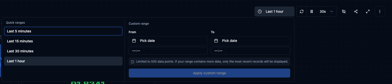
Choose a quick range or define a custom From/To window for your dashboard.
Auto-Refresh
Dashboards refresh automatically at a configurable interval. Click the refresh-rate dropdown in the toolbar (e.g. 30s) to change it. Available rates:
| Rate | Use Case |
|---|---|
| Off | Manual refresh only — useful for reviewing a static snapshot. |
| 5 s | High-frequency monitoring like vibration or rapid sensor readings. |
| 10 s | Standard real-time observation. |
| 30 s | Moderate update pace for slower-moving metrics. |
| 1 min | Periodic checks without constant updates. |
| 5 min | Background monitoring where near-real-time is sufficient. |
You can pause auto-refresh at any time and resume it later. A manual Refresh button is always available regardless of the auto-refresh setting.
Dashboard History
Every change to a dashboard is versioned. The History view shows who changed what and when, allowing you to review or restore a previous version if needed.
Sharing and Access
Dashboards respect MaestroHub's role-based access control (RBAC). Depending on your permissions you may be able to view, edit, or delete a dashboard. Organise dashboards into folders and apply labels to make them easy to discover for the right teams.
Limits at a Glance
| Limit | Value |
|---|---|
| Topics per panel (default) | 10 |
| Topics per Stat / Gauge panel | 1 |
| Labels per dashboard | 10 |
| Data points per query | 500 |
| Grid columns | 24 |
| Minimum panel size | 2 x 2 grid units |
| Row height | 80 px |
| Panel margin | 16 px |