DFS Energy Monitoring Dashboard
The DFS Energy Monitoring dashboard provides real-time electrical energy monitoring for the Brake Caliper Line BC-01 — consumption, cost, carbon footprint, and state-correlated efficiency. It is included in the .mhub.json export and is automatically available after import.
The dashboard is large; the screenshots below walk through it section by section.
Title Prefix Convention
The dashboard is split into two visual sections by a title-prefix convention:
Line •— line-aggregated panels that always show data from all four stations.${station} •— per-station panels driven by the station picker at the top-left. Selecting a station (OP10-CNC, OP20-CNC, OP30-WASH, or OP40-TEST) updates every panel whose title starts with${station} •simultaneously.
At a glance the operator can tell which panels react to the picker without scrolling.
Time Range
All panels respect the time range selector in the top toolbar. With the default Last 5 minutes range, every panel calculates from data within that exact window. The dashboard refreshes every 5 seconds.
Energy deltas (kWh) are derived from the actual data available in the selected window. If you select "Last 15 minutes" but DFS has only been running for 5 minutes, the delta is taken from the 5 minutes of real data — the 10 minutes with no data contribute nothing.
Panels
The dashboard has two sections: the Line section (top, always line-level) and the Station section (bottom, driven by ${station}).
Line Section
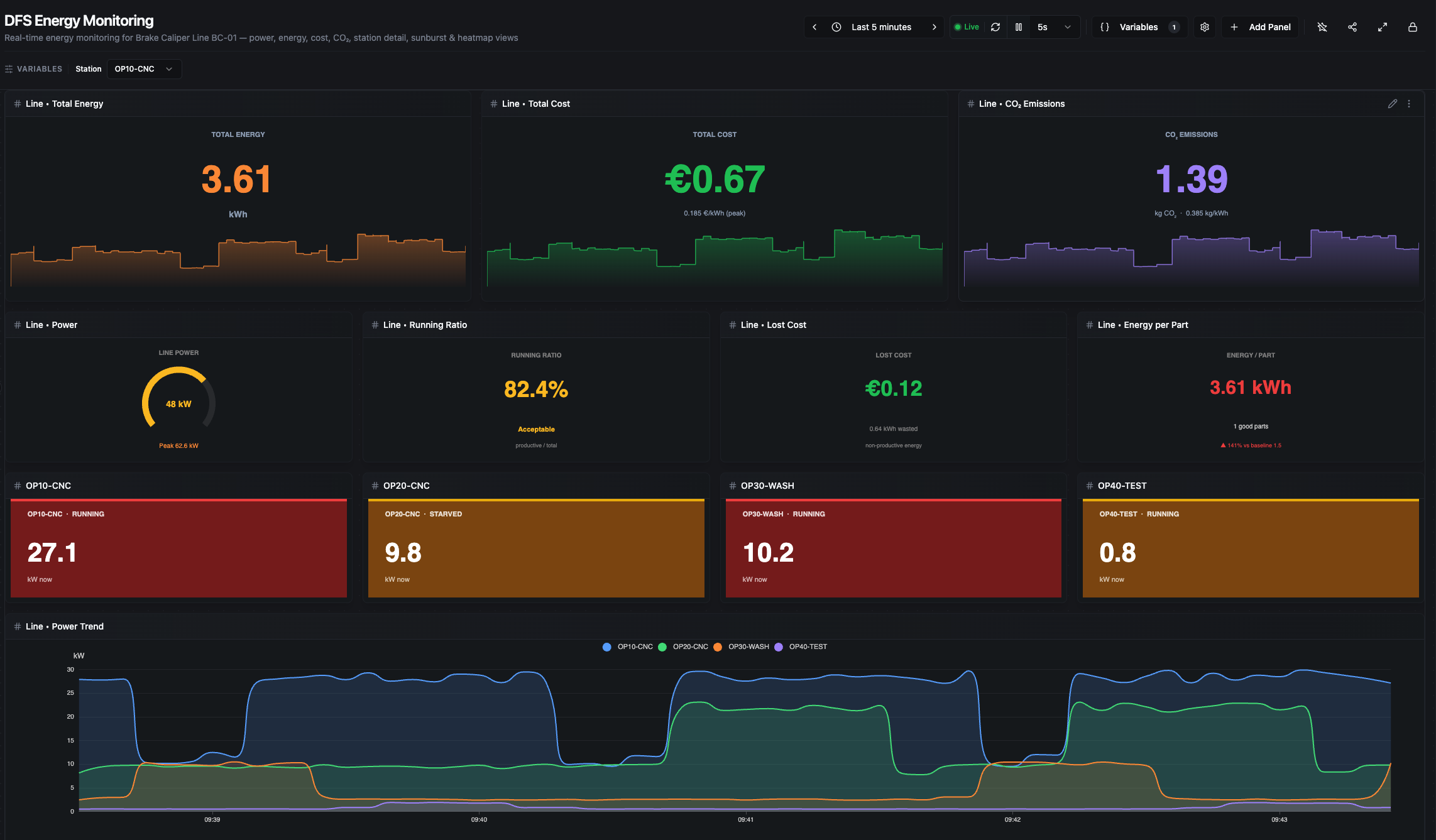
Line section (part 1) — headline KPIs, secondary KPIs, per-station snapshot cards, and the Line Power Trend
Line • Total Energy
Large orange kWh headline (cumulative energy across all four stations over the selected range) with a sparkline background showing summed line power_kw. Calculated as the sum of per-station energy_kwh deltas:
total_kwh = Σ (energy_kwh[last] − energy_kwh[first]) for each station
Data source: equipment/{OP10,OP20,OP30,OP40}/energy/energy_kwh.
Line • Total Cost
Cumulative cost in euros: total_kwh × tariff. The tariff is chosen by the current clock hour at render time — peak (0.185 €/kWh, 07:00–22:00) or off-peak (0.095 €/kWh, 22:00–07:00). The sub-line shows the active tariff.
Data sources: same as Total Energy.
Line • CO₂ Emissions
Cumulative carbon footprint: total_kwh × 0.385 (German grid average, kg CO₂/kWh). Large purple kg number with a kg/h sparkline.
Data sources: same as Total Energy.
Line • Power
Half-arc gauge showing NOW (sum of the latest power_kw across all four stations) with a footer reporting the peak observed inside the selected range. Thresholds: < 25 kW green (mostly idle), 25–50 kW amber (normal production), ≥ 50 kW red (peak demand warning).
Data source: equipment/{station}/energy/power_kw.
Line • Running Ratio
production_energy / total_energy × 100 where production_energy is the kWh consumed while any station was in RUNNING state. Labels: Excellent ≥ 85%, Acceptable 60–85%, Poor < 60%.
Data sources: equipment/{station}/energy/* + equipment/{station}/status/state.
Line • Lost Cost
Monetary value of the non-running energy over the range: (total_kwh − production_kwh) × tariff. This is the "idle burn" — euros spent while no station was producing. Thresholds: < €1 green, < €5 amber, ≥ €5 red.
Data sources: same as Running Ratio.
Line • Energy per Part
total_kwh / parts_good_delta(OP40) — the kWh it took to produce one good part through the entire line. Trend color compares against a baseline of 1.5 kWh/part (±10% green, ±20% amber, >20% red).
Data sources: equipment/{station}/energy/energy_kwh, equipment/OP40-TEST/counters/parts_good.
Station Snapshot Cards (OP10 / OP20 / OP30 / OP40)
Four colored cards showing each station's current power_kw and status/state. Background color tier is per-station (CNC threshold 22 kW, Wash 10 kW, Test 3 kW) — green/amber/red based on how hard that station is pulling right now. Independent of the station picker.
Data sources: equipment/{station}/energy/power_kw, equipment/{station}/status/state.
Line • Power Trend
Smooth filled area lines, one per station, overlaid (not stacked). Reveals which station dominates consumption and when spikes occur. Tooltip uses a nearest-value lookup so all four stations appear even when samples are sparsely aligned.
Data source: equipment/{station}/energy/power_kw.
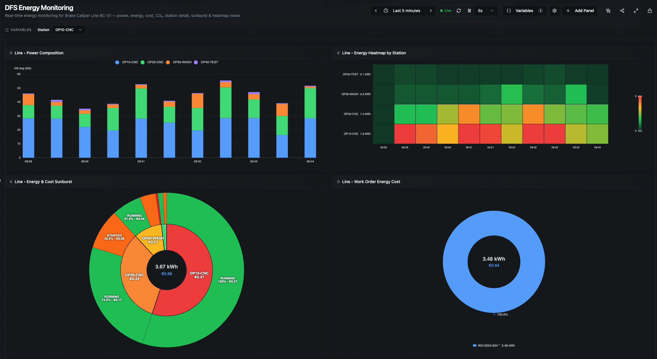
Line section (part 2) — Power Composition, Energy Heatmap by Station, Energy & Cost Sunburst, and Work Order Energy Cost
Line • Power Composition
Stacked bar chart of power_kw bucketed over time — bar height is the total line power per bucket. Bucket size is adaptive to the selected range (30 s → 1 d), keeping roughly 30–170 buckets visible:
| Range | Bucket |
|---|---|
| ≤ 15 min | 30 s |
| ≤ 1 h | 1 min |
| ≤ 6 h | 5 min |
| ≤ 24 h | 15 min |
| ≤ 7 d | 1 h |
| ≤ 30 d | 6 h |
| > 30 d | 1 d |
Data source: equipment/{station}/energy/power_kw.
Line • Energy Heatmap by Station
Same adaptive bucketing. Rows = stations (with total kWh labels), columns = time, color scale dark green → green → amber → red. Instantly surfaces which station burned the most energy and when.
Data source: equipment/{station}/energy/energy_kwh.
Line • Energy & Cost Sunburst
Two-level sunburst: inner ring is per-station ΔkWh, outer ring is per-state energy computed via state×power correlation. Center text shows total kWh and €cost for the selected range.
Data sources: equipment/{station}/energy/*, equipment/{station}/status/state.
Line • Work Order Energy Cost
Donut chart of energy consumed per production order. Each orders/order_id change closes a period clamped to the selected range; the slice's kWh is the line energy delta across that clamped period. The active in-progress order is marked with *. Tooltip shows duration, parts/good/scrap/rework (as within-range deltas), kWh, €cost, and kWh per good part.
Data sources: production/orders/order_id, equipment/{station}/energy/energy_kwh, order counters.
Station Section
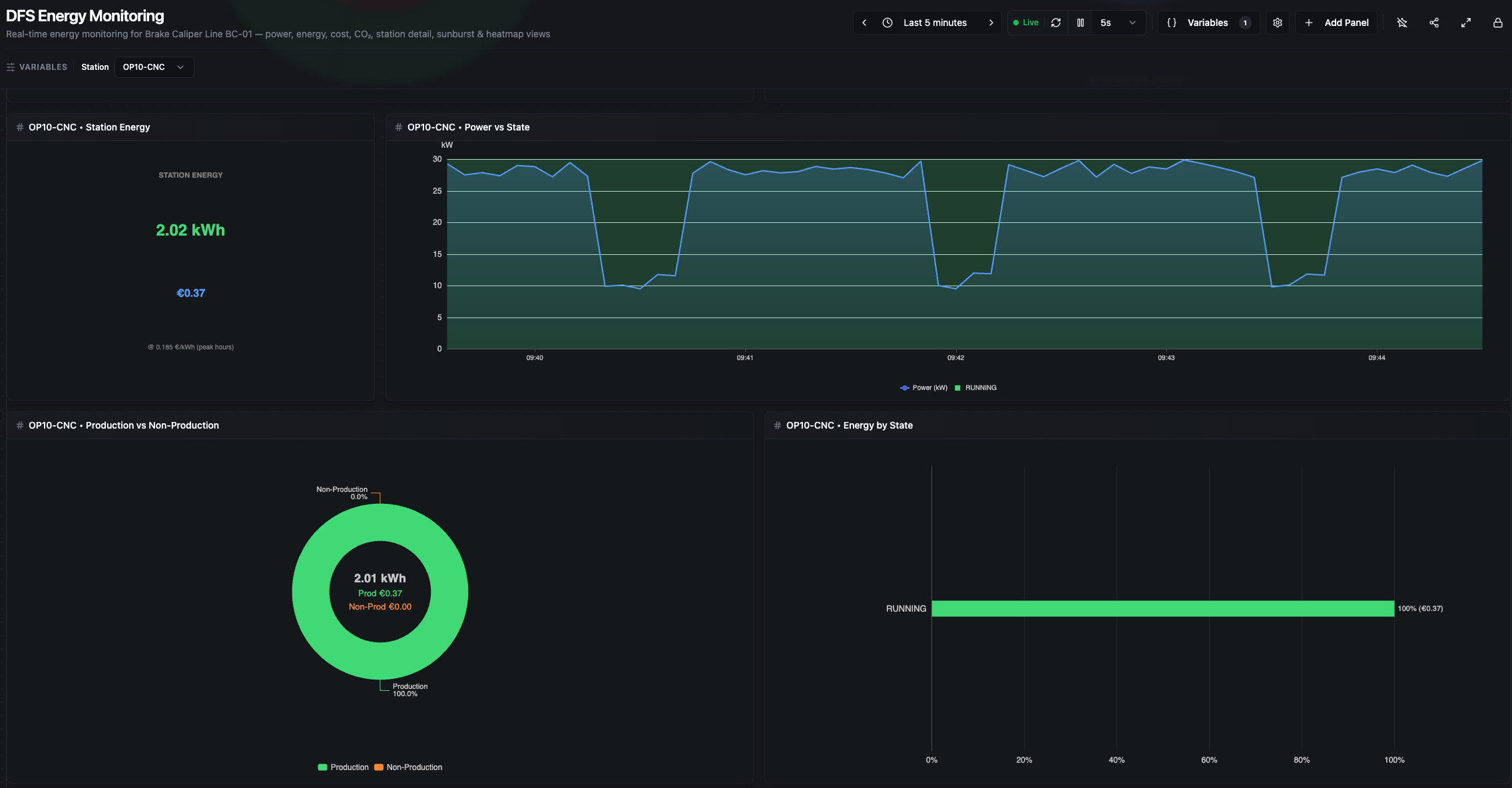
Station section (part 1) — Station Energy, Power vs State, Production vs Non-Production, and Energy by State (shown here for OP10-CNC)
${station} • Station Energy
Large green kWh headline plus €cost subtitle for the selected station. Computed as energy_kwh[last] − energy_kwh[first]. Background sparkline is the station's power_kw; footer shows current kW draw and active tariff. Matches the Energy by State total exactly (see calculation notes).
Data source: equipment/${station}/energy/energy_kwh, power_kw.
${station} • Power vs State
Power line overlaid on state-colored background bands. Tooltip is enriched — hovering any point shows the state name, the duration of that state interval, the kWh consumed in it, and its €cost. This is the most diagnostic panel: the contrast between ~28 kW PROCESSING and ~8 kW IDLE makes waste immediately visible.
At long ranges, intervals shorter than 0.1% of the window are filtered out and markArea opacity adapts for readability.
Data sources: equipment/${station}/energy/power_kw, equipment/${station}/status/state.
${station} • Production vs Non-Production
Binary donut: RUNNING energy (green) vs. every other state combined (orange). Center shows total kWh with a €cost split between Production and Non-Production. The fastest visual answer to "how much of this station's energy was actually productive?".
Data sources: same as Power vs State.
${station} • Energy by State
Horizontal bar chart showing the percentage of kWh spent in each state, sorted descending. Each bar's label shows X.X% (€Y.YY). The sum of bars is scaled to match the Station Energy ΔkWh exactly (see calculation notes).
Data sources: same as Power vs State.
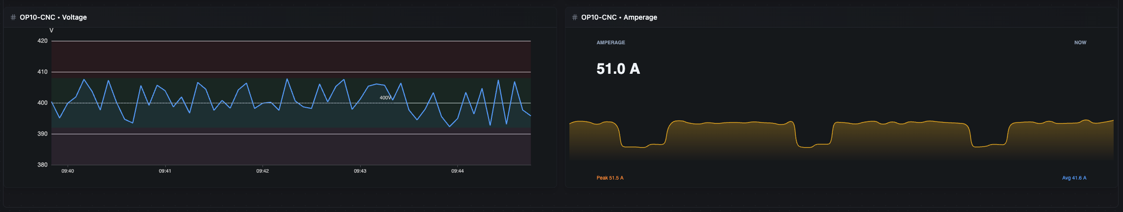
Station section (part 2) — Voltage with adaptive ±2% bands around nominal, and Amperage with peak/average footer
${station} • Voltage
Raw voltage series over time. The panel auto-detects nominal voltage from the latest value — < 300 V → 230 V single-phase, ≥ 300 V → 400 V three-phase — then draws ±2% bands (green inside, red outside) with a dashed nominal reference line.
Data source: equipment/${station}/energy/voltage.
${station} • Amperage
Large A headline plus sparkline of current over time. Footer shows peak and average amperage in the range. Sudden current spikes often correlate with tool engagement or mechanical issues.
Data source: equipment/${station}/energy/current.
How Energy Calculations Work
All calculations happen in the dashboard panels — no energy pipelines are required. There are three distinct calculation paths:
1. Energy delta (ground truth). Every "total kWh" headline is energy_kwh[last] − energy_kwh[first] over the range. The simulator publishes energy_kwh as a cumulative counter, so delta is lossless.
2. State-energy correlation (for state breakdowns). For each state-transition record, duration is next.timestamp − this.timestamp (the last record extends to the effective range end), clamped to the selected range. The algorithm reads the closest power_kw at the interval start and accumulates power × duration per state. Range clamping is critical — without it, sparse state records from before the range would credit their full historical duration to the window and inflate state energy by 5–10×.
3. Scaling to reconcile. State-correlation is an integration approximation; energy_kwh delta is the cumulative counter. After correlation, per-state energies are rescaled so their sum equals the ΔkWh — guaranteeing that Energy by State's bar sum, Production vs Non-Production's center, and Station Energy's headline all agree to the cent.
How Time Ranges Are Detected
The state-energy algorithm uses the first and last timestamps of actual data for the effective range — not Date.now(). This makes it correct for:
- Live relative ("Last 5m"): effective end ≈ now.
- Calendar ("Yesterday", "Previous week"): effective end is the last real data timestamp inside the selection.
- Absolute custom (entirely in the past): same as calendar — no ghost time beyond the data.
Tariff and Carbon Factor
- Tariff (hardcoded in panel JS, documented in
factory.yaml::commercial:):- Peak 07:00–22:00 → 0.185 €/kWh
- Off-peak 22:00–07:00 → 0.095 €/kWh
- Chosen by the current clock hour at render time. A range that crosses peak/off-peak uses a single rate — this is a simplification, not a billing-grade calculation.
- Carbon factor: 0.385 kg CO₂/kWh (German grid 2022 average).
- Energy/Part baseline: 1.5 kWh/part.
Edge Cases
Cold start. When DFS starts fresh, energy KPIs show tiny values until enough energy_kwh counter samples accumulate (~10 seconds). The Power gauge and station snapshot cards react instantly because they use the latest power_kw sample.
Time range longer than uptime. If you select "Last 15 minutes" but DFS has been running for 5 minutes, deltas and state correlation are computed only from the 5 minutes of real data. The remaining 10 minutes contribute nothing — the dashboard does not invent idle time.
No active work order. The Line • Work Order Energy Cost donut shows whatever order values are present, or an empty state if no orders have been published. All other panels are unaffected — energy calculations are independent of order metadata.
No production in window. If no good parts were produced, Energy per Part shows a "waiting" state (division by zero is guarded). All power and energy panels still show the consumption during that period, which is exactly the point — you can see idle burn even when nothing was made.
Range crossing peak/off-peak boundary. Cost is computed with a single tariff based on the current clock hour, so a range that straddles 22:00 uses one rate. Treat the €cost as indicative, not billing-grade, for such ranges.
All topic paths referenced above are under mHv1.0/dfs/LINE-BC-01/.