Dashboards
Dashboards let you build custom monitoring screens from UNS data. Pick the topics you care about, choose a visualisation type, and arrange panels on a flexible grid — all in one place. Whether you need a high-level overview of an entire production line or a focused view of a single sensor, dashboards adapt to your use case.
Why Dashboards? Data Explorer shows one topic at a time. Dashboards let you combine multiple topics into a single screen so you can correlate signals, spot patterns, and share views with your team.
Dashboard List
When you open the Dashboards page you see all existing dashboards. You can switch between grid and list views, search by name or description, and filter by All, Starred, or Recent tabs.
- Folders — group related dashboards together on the left panel (e.g. one folder per production line or per team). Click New Folder to create one.
- Star — pin a dashboard to your quick-access list so it appears under the Starred tab.
- Recent — dashboards you opened recently are tracked automatically for quick access.
- Duplicate — use the context menu on a dashboard card to clone it as a starting point for a new one.
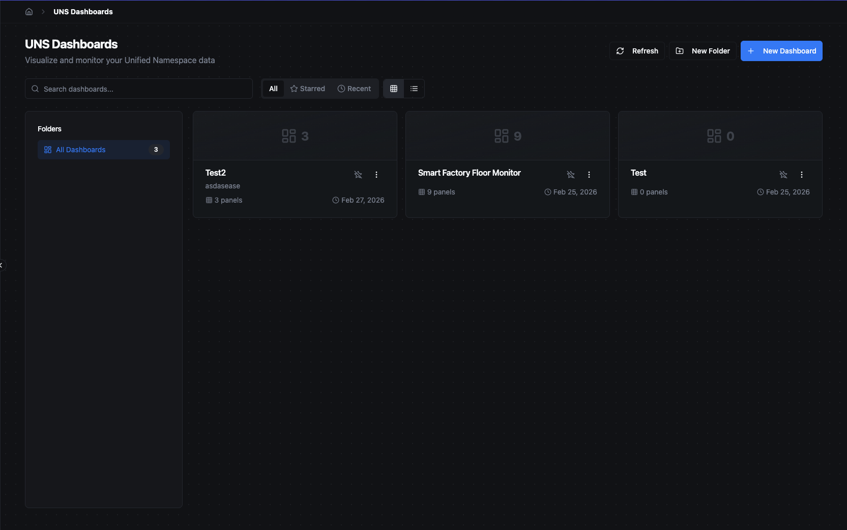
Dashboard list with folder navigation, search, and grid/list view toggle.
Creating a Dashboard
Click + New Dashboard to open the creation dialog. Enter a Name for the dashboard and an optional Description, then click Create. The dashboard opens immediately, ready for you to add panels.
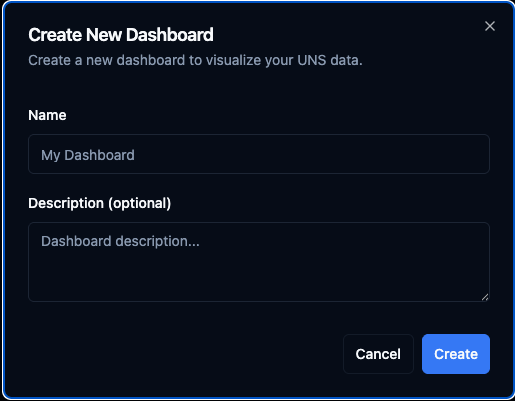
Create a new dashboard by providing a name and optional description.
Dashboard Tabs
Dashboards open in tabs along the top of the page, similar to browser tabs. You can have multiple dashboards open at once and switch between them instantly without losing your scroll position or time range.
- Click a dashboard in the list to open it in a new tab (or focus the existing tab if it is already open).
- Close a tab with the × button on the tab. Closing the last tab returns you to the dashboard list.
- Tabs are capped at 20 open dashboards. When the limit is reached, the least-recently-used tab is automatically evicted.
- Use the + button on the tab bar to open a dashboard picker and quickly search for or jump to another dashboard.
Dashboard View
A dashboard displays all its panels side by side on a grid. The toolbar at the top gives you quick access to:
- Time range selector with quick presets and custom date picker
- Refresh controls — manual refresh, pause/resume, and auto-refresh interval
- Add Panel — opens the panel editor to add a new panel
- Settings — opens the dashboard settings dialog (folder, description, labels, default time range, auto-refresh)
- Star, Share (copy link), and Full-screen buttons
- Lock / Unlock toggle — switches between view mode and edit mode
When unlocked (edit mode), you can drag and resize panels on the grid, edit the dashboard name and description inline by clicking on them, and access per-panel actions (edit, duplicate, delete) that appear on hover.
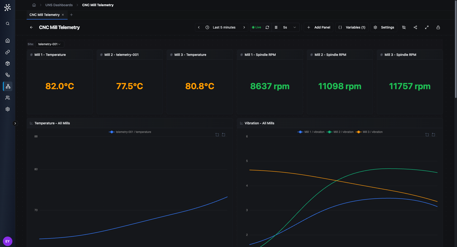
A dashboard showing stat panels and line charts with a Variable Bar at the top. The toolbar provides time range, refresh controls, Add Panel, Variables, Settings, and a lock toggle.
Panels
Panels are the building blocks of a dashboard. Each panel connects to one or more UNS topics and renders the data with a chosen visualisation.
Adding a Panel
Click Add Panel in the toolbar. The panel editor dialog opens with two columns:
Left — Data Sources (Queries): Add one or more queries, each targeting a UNS topic. Every query gets a reference ID (A, B, C, …) and lets you select specific fields from that topic. This allows you to combine data from multiple topics in a single panel with per-topic field selection.
Right — Visualization & Options: Choose a visualisation type from the grid (grouped by category). The editor highlights compatible types based on your selected fields and disables incompatible ones. A live preview updates instantly as you change your selections. Below the preview, expand Options to configure type-specific settings and Series Overrides for per-series styling.
The panel title is auto-generated from your field selection but can be overridden manually.
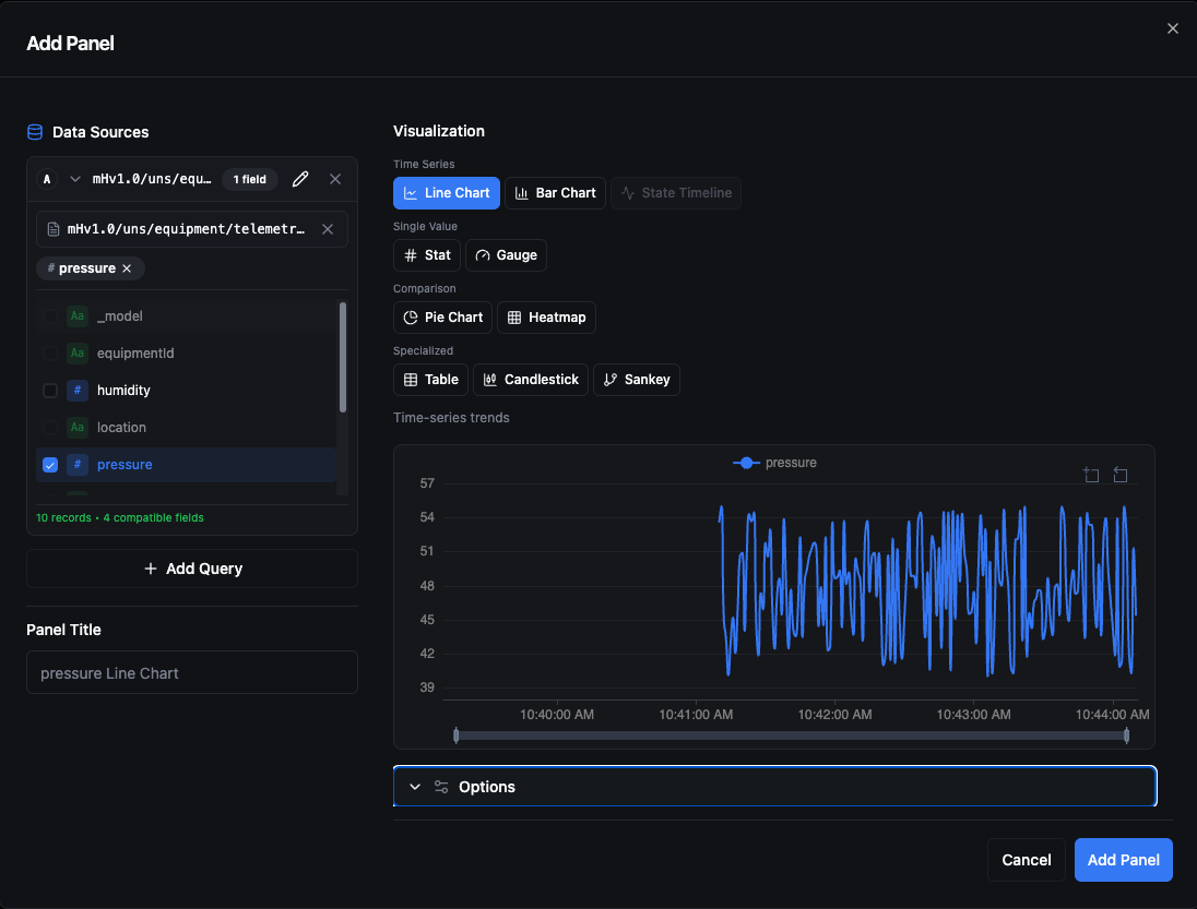
The panel editor: select a topic and fields on the left, choose a visualisation type on the right, and see a live preview before adding.
When adding a query, click the topic area to open the Select Topic dialog. Browse the UNS hierarchy or search by name to find the topic you want.
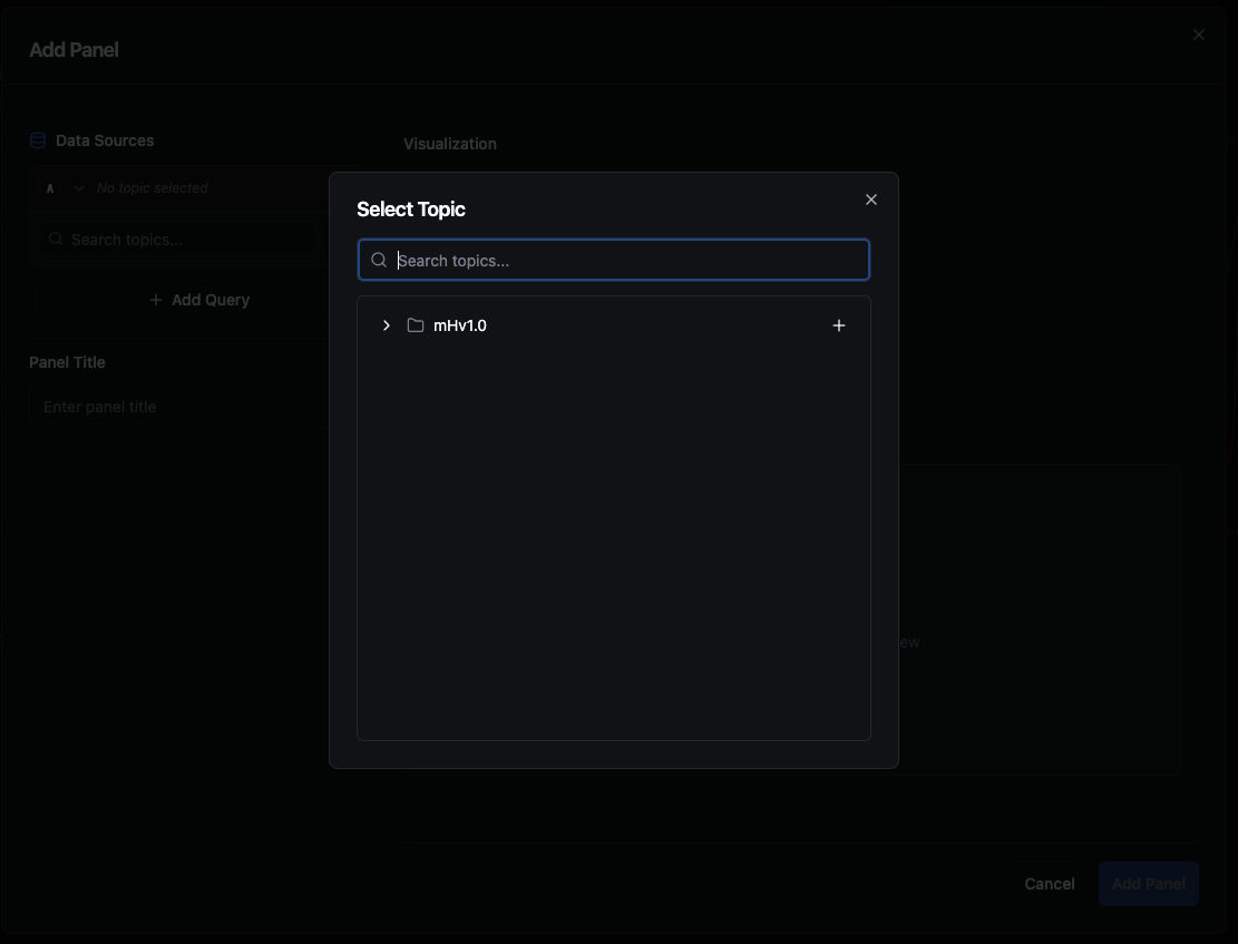
Browse or search the UNS topic tree to select a topic for your query.
Panel Types
| Type | Best For | Notes |
|---|---|---|
| Line | Time-series trends | Line width, fill opacity, point size, staircase mode, Y-axis zoom, and Y-axis min/max. |
| Stat | Single current value | Large number display. Color modes: value, background, or none. Sparkline graph modes: area, line, or none. |
| Gauge | Value within a range | Shows where the current value sits between a defined min and max. |
| Bar | Categorical comparison | Horizontal or vertical orientation. Dual Y-axis support for mixed-unit series. |
| Pie | Part-to-whole ratios | Donut mode available. Labels can be inside, outside, or hidden. Up to 6 fields. |
| Heatmap | Density over time | Color scheme, aggregation method, and configurable bucket size. |
| Candlestick | OHLC data | Map open, high, low, close fields (up to 4) and optionally display volume. Custom up/down colours. |
| Sankey | Flow between stages | Define source, target, and value fields for flow visualisation. Up to 3 fields. |
| Table | Raw tabular data | Column selection, sortable by any field. |
| State Timeline | State changes over time | Ideal for boolean or categorical values like machine on/off status. Supports value mappings for custom labels and colours. |
| Custom | Advanced / bespoke charts | Write custom ECharts option code for full control over the visualisation. |
Topic Limits per Panel
Most panel types support up to 10 topics. Single-value panels (Stat and Gauge) are limited to 1 topic since they display one number at a time.
Value Formatting
Every panel supports value formatting options:
- Unit — choose from built-in units (%, °C, °F, ms, s, bytes, KB, MB, GB, KB/s, MB/s, rpm, psi, bar, V, A, W, kW, Hz) or define a Custom unit.
- Decimals — set the decimal precision (0–6) or leave it on Auto.
Threshold Bands
Line and bar charts support threshold bands — coloured regions drawn on the chart to highlight acceptable or critical ranges:
- Band mode — a shaded area between a min and max value with configurable colour and opacity.
- Line mode (Set Point) — a horizontal line at a specific value. Line style can be solid, dashed, or dotted.
Threshold bands can be defined at the panel level or per-series through series overrides.
Series Overrides
For line and bar charts, series overrides let you customise the appearance of individual data series. Each override targets series using a matcher:
- By Query — match all series from a specific query (A, B, C, …).
- By Regex — match using a regular expression pattern.
Override types:
| Type | Properties |
|---|---|
| Style | Colour, line width, fill opacity, point size, line style (solid / dashed / dotted), Y-axis side (left / right), display name, and hidden toggle. |
| Unit | Override the unit for a specific series (useful when mixing metrics on one chart). |
| Thresholds | Add per-series threshold bands with their own colours and opacity. |
Panel-Specific Options
Line Chart
- Line Width — 1–5 px
- Fill Opacity — 0–50%
- Point Size — 0–10 px (0 hides points)
- Staircase — step interpolation instead of smooth lines
- Y-Axis Min / Max — fix the axis range
- Y-Axis Zoom — allow interactive zooming on the Y axis
- X-Axis — label rotation (0°–90°), time format (HH:mm, HH:mm:ss, MM/dd HH:mm, dd/MM HH:mm), and show/hide labels
- Legend Position — top, bottom, left, or right
- Threshold Bands and Alert Border (colour the panel border based on alert state)
Bar Chart
- Orientation — horizontal or vertical
- Show Values — display data values on bars
- Y-Axis Min / Max — fix the axis range
- Dual Y-Axis — auto-assign alternating series to left and right axes
- X-Axis — label rotation and time format (same options as line chart)
- Legend Position — top, bottom, left, or right
- Threshold Bands
Stat
- Color Mode — value, background, or none
- Graph Mode — area sparkline, line sparkline, or none
- Text Mode — value only, name only, or value and name
- Unit and Decimals
Gauge
- Min / Max — value range
- Show Min/Max labels
- Unit and Decimals
Pie
- Donut Mode — hollow centre
- Label Position — inside, outside, or hidden
Heatmap
- Color Scheme — blues, greens, reds, or viridis
- Aggregation — avg, sum, count, max, or min
- Bucket Size — 5m, 15m, 30m, 1h, 1d, or 1w
State Timeline
- Legend — toggle and position (top, bottom, left, right)
- Value Mappings — map raw values to custom display text and colours (e.g. map
1→ "Running" in green,0→ "Stopped" in red)
Table
- Sort By — field and direction (asc / desc)
- Unit for default column formatting
Candlestick
- Field mapping for open, high, low, close
- Show Volume toggle with volume field mapping
- Up / Down Colour — customise the colours for rising and falling candles
Sankey
- Source, target, and value field selection
- Node Alignment — left, right, centre, justify
Custom (ECharts)
Write JavaScript code that returns an Apache ECharts option object. The panel evaluates your code and renders whatever ECharts configuration you return, giving you full control over the chart type and appearance.
A context object is injected into your code with the following properties:
| Property | Type | Description |
|---|---|---|
context.data | Array<Record> | Array of data records. Each record has a timestamp (ISO string), topic (string), and one key per field returned by the query (e.g. { timestamp, topic, temperature, pressure }). |
context.queries | DataQuery[] | The queries configured for this panel: [{ refId, topic, fields, alias }, ...]. Useful for building dynamic series from multiple queries. |
context.echarts | echarts | A reference to the ECharts library itself, giving you access to utilities like echarts.graphic.LinearGradient. |
context.theme | 'dark' | 'light' | The current UI theme, so you can adapt colours accordingly. |
Your code must return a plain ECharts option object. If it returns nothing or throws an error, the panel displays an error message with the exception details.
Example — basic line chart:
const { data, theme } = context;
const isDark = theme === 'dark';
const textColor = isDark ? '#ccc' : '#333';

return {
  backgroundColor: 'transparent',
  tooltip: { trigger: 'axis' },
  xAxis: {
    type: 'category',
    data: data.map(d => new Date(d.timestamp).toLocaleTimeString()),
    axisLabel: { color: textColor },
  },
  yAxis: {
    type: 'value',
    axisLabel: { color: textColor },
  },
  series: [{
    type: 'line',
    data: data.map(d => {
      const { timestamp, topic, ...fields } = d;
      const vals = Object.values(fields).filter(v => typeof v === 'number');
      return vals[0] ?? null;
    }),
    smooth: true,
  }],
};
The default custom code rendered as a smooth line chart with time-based X axis.
Common Options
All panel types share these options:
- Show Legend — toggle the chart legend. For chart types that support it (line, bar, state timeline), you can also set the legend position (top, bottom, left, or right).
- Data Point Limit — max data points per topic, configurable from 50 to 7 200 (default: 500)
- Alert Border — when enabled, the panel border changes colour based on the alert state (ok, warning, critical).
Layout
Dashboards use a 24-column grid. Each panel occupies a position (x, y) and a size (width, height) measured in grid units.
- Drag a panel by its handle to reposition it on the grid (edit mode only).
- Resize a panel by pulling its corner grips (edit mode only).
- Minimum panel size is 2 x 2 grid units.
- Maximum width is 24 grid units (full row). Height is unlimited.
- Panels snap into place automatically with a 16 px margin between them.
Each panel type has a sensible default size when first added (e.g. Line charts default to 12 x 4, Stat panels to 4 x 2).
Dashboard Variables
Dashboards support template variables that make panels dynamic. Variables appear as dropdowns in a Variable Bar at the top of the dashboard and can be referenced in topic patterns using ${variableName} syntax. When a variable value changes, every panel whose topic pattern references it is re-queried automatically.
Click Settings → Variables (or the variable icon in the toolbar when in edit mode) to open the Variable Editor.
| Variable Type | Description |
|---|---|
| Topic Segment | Populates its dropdown from the distinct values at a specific level in the UNS topic hierarchy (0-based). Optionally filter by a topic prefix. The options are fetched from the server, so the list stays in sync with your live topics. |
| Custom | A list of predefined values to choose from. |
| Constant | A fixed value that cannot be changed by viewers — useful for shared configuration across panels (e.g. a base topic prefix). |
Options available on all variable types:
- Label — the display name shown in the Variable Bar.
- Default Value — the value selected when the dashboard first loads.
Options for Topic Segment and Custom variables:
- Multi-select — allow selecting more than one value at a time. When multiple values are selected, the panel's topic pattern is expanded into a Cartesian product of all combinations (capped at 100 expanded topics).
- Include All — adds an "All" option that selects every available value.
A dashboard can have up to 20 variables. Variable names are limited to 64 characters.
Example: Create a variable named site with type Custom and options plant-a, plant-b. Then use mHv1.0/${site}/temperature as a topic pattern. Switching the variable updates all panels at once.
Time Range
Every dashboard has a global time range that applies to all panels. Click the time range button in the toolbar to open the selector. The picker is split into three sections:
Quick shift — nudge the current window forward or backward by a configurable amount (e.g. 1 hour).
Relative ranges — predefined windows such as Last 5 minutes, Last 15 minutes, Last 30 minutes, Last 1 hour, Last 6 hours, Last 12 hours, Last 24 hours, Last 7 days, and Last 30 days. A Calendar group provides options like Today so far, Yesterday, This week so far, This month so far, and Previous week.
Absolute time range — enter exact From and To values. You can use absolute dates or relative expressions like now-6h. Recently used absolute ranges are shown below for quick re-selection.
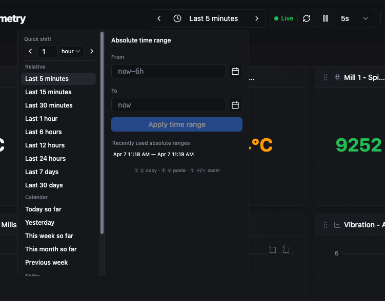
The time range picker: quick-shift buttons, relative presets, calendar shortcuts, and an absolute From/To range with recent history.
Auto-Refresh
Dashboards refresh automatically at a configurable interval. Click the refresh-rate dropdown in the toolbar (e.g. 30s) to change it. Available rates:
| Rate | Use Case |
|---|---|
| Off | Manual refresh only — useful for reviewing a static snapshot. |
| 5 s | High-frequency monitoring like vibration or rapid sensor readings. |
| 10 s | Standard real-time observation. |
| 30 s | Moderate update pace for slower-moving metrics. |
| 1 min | Periodic checks without constant updates. |
| 5 min | Background monitoring where near-real-time is sufficient. |
You can pause auto-refresh at any time and resume it later. When auto-refresh is active and not paused, a green Live indicator appears next to the refresh controls. A manual Refresh button is always available regardless of the auto-refresh setting.
Dashboard Settings
Click Settings in the toolbar to configure dashboard-level properties:
- Folder — move the dashboard into a folder for organisation.
- Description — add or update the dashboard description.
- Labels — key-value pairs for filtering and discovery (up to 10).
- Default Time Range — the time range applied when the dashboard first loads.
- Auto Refresh — the default auto-refresh interval.
Dashboard Branding
Dashboards support custom branding to match your organisation's visual identity or to provide contextual backdrops (e.g. a factory floor plan).
Background Image
Upload a background image that is displayed behind all panels. Supported formats are JPEG, PNG, and WebP.
- Fit — how the image fills the dashboard canvas:
cover(fill and crop),contain(fit without cropping),repeat(tile), orcenter(original size, centred). - Opacity — 0–100%. Lower values let the panels stand out against the image.
Logo
Upload a logo that appears as an overlay on the dashboard. The logo uses the default processor limits (max 3 MB, 300 × 300 px).
- Position — top-left, top-right, bottom-left, bottom-right, or centre.
- Opacity — 0–100%.
- Size — 5–50% of the container width.
Panel Transparency
When a background image is active, you can increase panel transparency so the background shows through panel cards. This is set as a percentage in the branding configuration.
To manage images, use Settings → Branding in the dashboard toolbar.